

 EN
EN  NL
NL 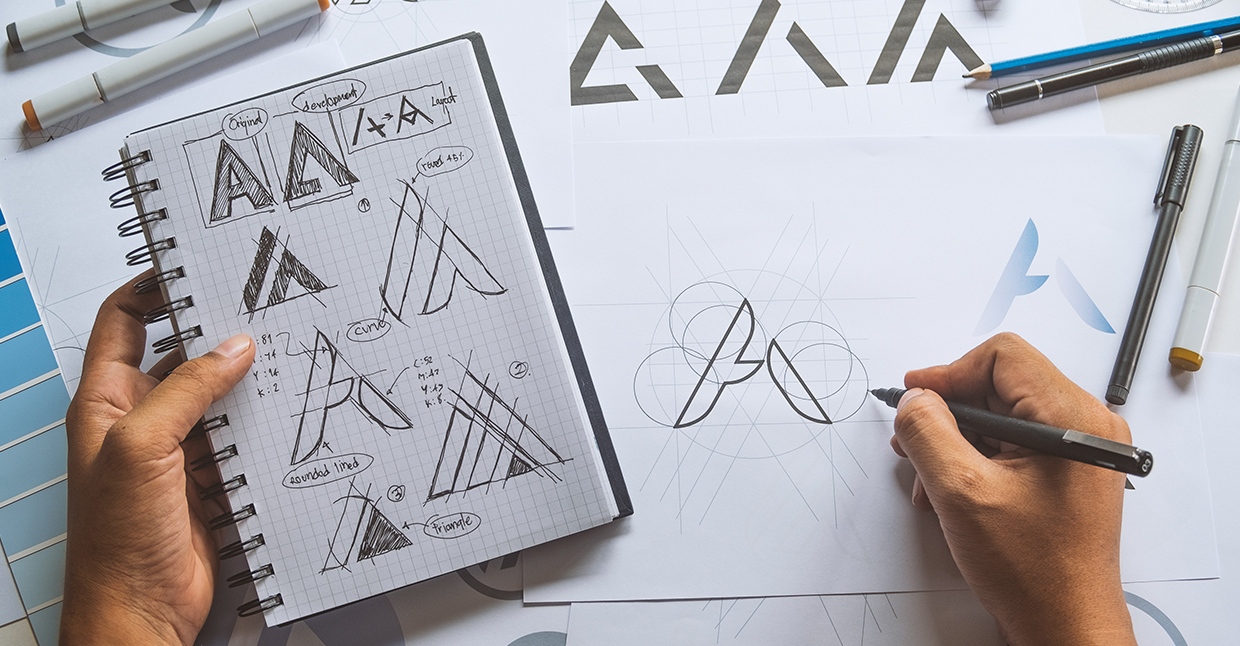
Brands have various reasons to revamp their logos. The goal of a rebranding might be to keep an outdated brand up-to-date or simply to make the logo more versatile and easily applicable in unforeseen uses, such as app iconography.
The power of logo design is undeniable, and a good logo design can create enormous brand awareness. Poor logo design, on the other hand, can be confusing, damage brand recognition, and ultimately affect sales. Therefore, a rebranding is always an exciting moment: will the new design still resonate?
In this blog, we discuss the 5 worst logo redesigns of recent years.
Redesign #1: KIA (or is it KN?)
Good logos are about recognisability and clarity. You should be able to recognise them on a billboard, but also when they are displayed in different colours on, for example, websites.
When a redesign undermines well-established brand recognition, you know something has gone seriously wrong. This happened to Kia, the South Korean car brand that is part of the Hyundai Motor Company. In 2021, they undertook a modernisation effort and also scrutinised the logo. However, the redesign proved so confusing that 30,000 people a month search for "KN car" on Google, as the new Kia logo closely resembles those letters. Fortunately for Kia, the problem is very easy to solve by placing a small dash in the A.
 .
. 
Redesign #2: Gap
Gap is a well-known retailer in clothing and accessories. In 2010, Gap decided to redesign its 20-year-old logo after declining sales figures due to the 2008 financial crisis, leading to the phenomenon "Gapgate".
After the Gap logo had been familiar to consumers for 20 years, it was revamped on 6 October 2010. The font was changed, and the well-known blue block was replaced with a smaller gradient block in the top right corner of the brand name. This rebranding is said to have cost the company about $100 million.
The redesign triggered a wave of reactions. Following the launch of a website called "Crap Logo Yourself", where people could develop their own 'Gap' logo, the backlash intensified, further damaging the brand's reputation. This led to the logo being reverted just 6 days after the change.
 .
. 
Redesign #3. Mastercard
The redesign of Mastercard in 2006 was a typical example of a well-intentioned attempt that went badly wrong. The new look, featuring an extra white circle, was part of a slight change in direction. The company aimed to better communicate its core values such as relationships, insight, and commerce. According to the public, the result was that Mastercard's new logo reflected the intended values, but failed to consider customer loyalty to the current brand.
Unfortunately, this design turned out completely wrong. Consumers found the new look confusing and garish, and the brand quickly lost the recognisability it had built up. The key takeaway from this is that a redesign can only be successful if it retains the essence of the brand and improves it in a more subtle way.

Redesign #4. Philips
In 2013, Philips, one of the world's most recognisable brands, underwent a rebranding. The company's iconic and simple logo, which had defined the brand's visual identity since 1995, was replaced with the old logo from 1968. In itself, there was nothing wrong with either logo, but from the perspective where consistency and recognisability are so important, Philips might have made other choices.
One of the most important aspects of a strong brand is visual stability. Consistency in the design and appearance of a brand ensures recognisability and reliability among customers. By reverting to an older logo, Philips disrupted its visual identity, reducing brand recognition. Moreover, it can also be seen as a lack of confidence in the original decision of the previous logo, which can damage customer trust in the brand.
A wise lesson that can be drawn from the redesign is that it is important for a brand to keep looking forward and continue to innovate while remaining true to the core values and visual identity of the brand. Therefore, it is not always the best solution to revert to an old logo or renew a logo, as this can lead to even more inconsistency and a weakened market position.

Redesign #5. Royal Mail
In January 2001, Royal Mail introduced an entirely new brand name and a matching logo. They changed the name to Consignia. The name 'Consignia' is derived from 'to consign', meaning to entrust something to another's care. In theory, the name change is not so strange. Unfortunately, the name was not positively received by the public. The general consensus was that the name was too long, too fussy, and did not roll off the tongue. Moreover, it did not help that the public felt the company was wrong to deviate from British heritage. Due to this uproar and the fact that many articles criticised the new name, the brand reverted to Royal Mail.
The example of Royal Mail shows that rebranding can seem exciting and idyllic, but it is often so important not to try to fix something that is not broken. Royal Mail could have saved a significant amount of money and mantained public trust if it had stayed true to its ‘roots’.
 .
. 
Test, test, test...
A redesign can make or break a brand. It is therefore always wise to test a potential redesign before rolling it out on a large scale. At Unravel, we regularly conduct Brand Assets Tests clients worldwide. In this way, we map out the uniqueness of their logo (does the customer still think of our brand instead of other brands?) and the associations the customer has with the new design. This way, we eliminate the uncertainty surrounding a redesign.
Curious about how Unravel can help you test your Brand Assets? Feel free to contact Tim via .


